# general use
library(here) # file organization
library(tidyverse) # manipulating
library(sf) # reading in spatial data, etc.
library(janitor) # cleaning variable names
library(lterdatasampler) # data source
library(randomcoloR) # random color generator
# Javascript package wrappers
library(leaflet) # interactive map
library(plotly) # interactive plots
library(ggiraph) # more interactive plots
library(echarts4r) # even more interactive plotsInteractive data visualization using Javascript packages
Set up
Interactive maps
leaflet is the go-to package for interactive maps. It’s not super for static maps, but for anyone looking to get an interactive map on their dashboard, this is a great option. In this example, we’re going to use some data from Niwot Ridge LTER to create a map of vegetation classes, snow surveys, pika locations, and landmarks at the site.
Here’s some cleaning code (we’re not going through this step by step):
# project extent
project_extent <- st_read(here::here("data", "nwt_project_extent", "shapefiles"), layer = "nwt_project_extent") %>%
st_transform(crs = 4326)Reading layer `nwt_project_extent' from data source
`/Users/An/github/interactive-data-vis/data/nwt_project_extent/shapefiles'
using driver `ESRI Shapefile'
Simple feature collection with 1 feature and 1 field
Geometry type: POLYGON
Dimension: XY
Bounding box: xmin: 443729 ymin: 4429472 xmax: 456216.7 ymax: 4437388
Projected CRS: NAD83 / UTM zone 13N# snow survey
snow2018 <- st_read(here::here("data", "ss2018", "shapefiles"), layer = "ss2018") %>%
st_transform(crs = 4326) %>%
clean_names() %>%
mutate(comments = case_when(
comments == "NaN" ~ "none",
TRUE ~ comments
)) %>%
mutate(marker_text = paste(
"Depth:", snowdepth, "<br>",
"Time:", sampletime, "<br>",
"Recorders:", recorders, "<br>",
"Comments:", comments, "<br>"
)) Reading layer `ss2018' from data source
`/Users/An/github/interactive-data-vis/data/ss2018/shapefiles'
using driver `ESRI Shapefile'
Simple feature collection with 562 features and 13 fields
Geometry type: POINT
Dimension: XY
Bounding box: xmin: 444936.5 ymin: 4432975 xmax: 448047.3 ymax: 4434298
Projected CRS: NAD83 / UTM zone 13N# vegetation classes
veg <- st_read(here::here("data", "veg", "shapefiles"), layer = "veg") %>%
st_transform(crs = 4326) %>%
clean_names() %>%
mutate(marker_text = paste(
"Type:", type, "<br>",
"Area:", area, "<br>",
"Perimeter:", perimeter, "<br>"
)) Reading layer `veg' from data source
`/Users/An/github/interactive-data-vis/data/veg/shapefiles'
using driver `ESRI Shapefile'
Simple feature collection with 1233 features and 6 fields
Geometry type: POLYGON
Dimension: XY
Bounding box: xmin: 446324.4 ymin: 4432792 xmax: 453721.1 ymax: 4435984
Projected CRS: NAD83 / UTM zone 13N# generating random colors for vegetation classes
veg_list <- veg %>%
pull(type) %>%
unique()
colors <- c(
"#1c6e73", randomColor(count = 23, luminosity = "random"), "#e3e5e6"
)
veg_pal <- colorFactor(colors, domain = veg$type, ordered = TRUE)
# landmarks
landmarks <- st_read(here::here("data", "nwt_annotation_pnt", "shapefiles"), layer = "nwt_annotation_pnt") %>%
st_transform(crs = 4326) %>%
clean_names() %>%
mutate(marker_text = paste(
"Name:", name
)) Reading layer `nwt_annotation_pnt' from data source
`/Users/An/github/interactive-data-vis/data/nwt_annotation_pnt/shapefiles'
using driver `ESRI Shapefile'
Simple feature collection with 40 features and 1 field
Geometry type: POINT
Dimension: XY
Bounding box: xmin: 444491 ymin: 4430127 xmax: 454307.8 ymax: 4436539
Projected CRS: NAD83 / UTM zone 13N# pikas
pikas <- st_as_sf(x = nwt_pikas, coords = c("utm_easting", "utm_northing")) %>%
st_set_crs("+proj=utm +zone=13 +datum=NAD83 +units=m") %>%
st_transform("+proj=longlat +datum=WGS84") %>%
mutate(marker_text = paste(
"Date:", date, "<br>",
"Station:", station, "<br>",
"Sex:", sex, "<br>"
))And here’s a map:
map <- leaflet() %>%
# base maps
addProviderTiles(providers$OpenTopoMap, group = "OpenTopoMap") %>%
# map layers: project boundary and vegetation classes
addPolygons(data = project_extent, color = "#488f32", group = "NWT project extent") %>%
addPolygons(data = veg, group = "Vegetation", popup = ~marker_text, fillColor = ~veg_pal(type), stroke = FALSE, fillOpacity = 1) %>%
# markers
addCircleMarkers(data = snow2018, group = "Snow surveys",
color = "lightblue", stroke = FALSE, fillOpacity = 1,
popup = ~marker_text,
popupOptions = popupOptions(closeOnClick = FALSE)) %>%
addCircleMarkers(data = landmarks, group = "Landmarks",
color = "yellow", stroke = FALSE, fillOpacity = 1,
popup = ~marker_text,
popupOptions = popupOptions(closeOnClick = FALSE)) %>%
addCircleMarkers(data = pikas, group = "Pikas",
color = "orange", stroke = FALSE, fillOpacity = 1,
popup = ~marker_text,
popupOptions = popupOptions(closeOnClick = FALSE)) %>%
# layers control
addLayersControl(
baseGroups = c("OpenTopoMap"),
overlayGroups = c("NWT project extent", "Vegetation", "Snow surveys", "Landmarks", "Pikas"),
options = layersControlOptions(collapsed = TRUE)
) %>%
# legends
addLegend(values = 1, group = "Snow surveys", position = "bottomleft", labels = "Snow surveys", colors = "lightblue", opacity = 1) %>%
addLegend(values = 2, group = "Landmarks", position = "bottomleft", labels = "Landmarks", colors = "yellow", opacity = 1) %>%
addLegend(values = 3, group = "Pikas", position = "bottomleft", labels = "Pikas", colors = "orange", opacity = 1) %>%
# scale bar
addScaleBar(position = "bottomright", options = scaleBarOptions(imperial = FALSE))
map Interactive plots
You can build interactivity into your plots using packages that are essentially wrappers for Javascript: you can get an interactive framework without having to learn a whole new language. We’re going to make the following plot interactive:
bg_col <- "#232324"
text_col <- "#f2f2f2"
weather <- arc_weather %>%
mutate(year = year(date),
month = month(date),
day = day(date)) %>%
mutate(season = case_when(
month %in% c(12, 1, 2) ~ "winter",
month %in% c(3, 4, 5) ~ "spring",
month %in% c(6, 7, 8) ~ "summer",
month %in% c(9, 10, 11) ~ "fall"
),
season = fct_relevel(season, c("winter", "spring", "summer", "fall"))) %>%
mutate(julian = yday(date)) %>%
mutate(marker_text = paste(
"Date: ", date, "<br>",
"Mean air temp (C): ", mean_airtemp, "<br>",
"Daily precipitation (mm): ", daily_precip, "<br>",
"Mean windspeed (m/s): ", mean_windspeed, "<br>"
))Static plot:
weather_static <- ggplot(data = weather, aes(x = julian, y = mean_airtemp, color = mean_airtemp, text = marker_text)) +
geom_point(alpha = 0.8) +
scale_color_gradient2(low = "#28ACE6", mid = "#FFFFFF", high = "#C13C31") +
geom_hline(yintercept = 0, lty = 2, color = "#C13C31", linewidth = 2) +
scale_x_continuous(expand = c(0, 0), limits = c(0, 366)) +
scale_y_continuous(expand = c(0, 0), limits = c(-56, 25)) +
labs(x = "Julian day", y = "degrees Celsius",
title = "Toolik Field Station is below freezing for most of the year.",
subtitle = "Each point represents mean air temperature on a given day of the year (Julian day) colored by temperature.") +
theme_bw() +
theme(text = element_text(family = "Garamond", color = text_col),
panel.grid = element_blank(),
legend.position = "none",
panel.background = element_rect(fill = bg_col, color = bg_col),
panel.border = element_blank(),
plot.background = element_rect(fill = bg_col, color = bg_col),
axis.text = element_text(color = text_col, size = 14),
axis.line = element_blank(),
axis.title = element_text(size = 14),
axis.ticks = element_blank(),
plot.title = element_text(size = 20, face = "bold"),
legend.background = element_rect(fill = bg_col))
weather_static 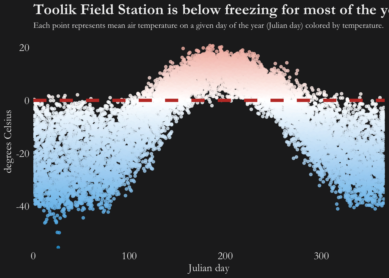
Option 1: Turn a ggplot object into an interactive graph with plotly
The easiest way to build in interactivity is to use plotly to get an interactive plot from a ggplot object.
There are other ways to use plotly too (check out the documentation), but the ggplotly() function is fairly powerful.
weather_ggplotly <- ggplotly(weather_static, tooltip = c("text")) %>%
layout(hoverlabel = list(
font = list(
family = "Garamond",
size = 12
)
)) %>%
layout(title = list(
text = paste0('Toolik Field Station is below freezing for most of the year.',
'<br>',
'<sup>',
'Each point represents mean air temperature on a given day of the year (Julian day) colored by temperature.',
'</sup>')
))
weather_ggplotlyOption 2: Use ggiraph’s unique geoms
ggiraph is another htmlwidgets package. There is a fairly well populated tutorial.
weather_ggiraph <- ggplot(data = weather, aes(x = julian, y = mean_airtemp, color = mean_airtemp,
tooltip = marker_text, data_id = marker_text)) +
geom_point_interactive() +
scale_color_gradient2(low = "#28ACE6", mid = "#FFFFFF", high = "#C13C31") +
geom_hline(yintercept = 0, lty = 2, color = "#C13C31", linewidth = 2) +
scale_x_continuous(expand = c(0, 0), limits = c(0, 366)) +
scale_y_continuous(expand = c(0, 0), limits = c(-56, 25)) +
labs(x = "Julian day", y = "degrees Celsius",
title = "Toolik Field Station is below freezing for most of the year.",
subtitle = "Each point represents mean air temperature on a given day of the year (Julian day) colored by temperature.") +
theme_bw() +
theme(text = element_text(family = "Garamond", color = text_col),
panel.grid = element_blank(),
legend.position = "none",
panel.background = element_rect(fill = bg_col, color = bg_col),
panel.border = element_blank(),
plot.background = element_rect(fill = bg_col, color = bg_col),
axis.text = element_text(color = text_col, size = 14),
axis.line = element_blank(),
axis.title = element_text(size = 14),
axis.ticks = element_blank(),
plot.title = element_text(size = 20, face = "bold"),
legend.background = element_rect(fill = bg_col))
weather_ggiraph_interactive <- girafe(
ggobj = weather_ggiraph,
width = 8, height = 5,
# bg = bg_col,
options = list(
opts_tooltip(
opacity = 0.8, use_fill = TRUE,
use_stroke = FALSE,
css = "padding:5pt;font-family: Garamond;font-size:1rem;color:white"),
opts_hover_inv(css = "opacity:0.4"),
opts_selection(
type = "multiple",
only_shiny = FALSE
)
)
)
weather_ggiraph_interactiveOption 3: echarts4r
This is the most complicated option - the documentation is fairly minimal. However, it’s cool. The guide is here.
airtemp_echarts4r <- weather %>%
group_by(year) %>%
e_charts(x = julian, timeline = TRUE) %>%
e_scatter(serie = mean_airtemp, symbol_size = 10) %>%
e_visual_map(min = -56, max = 21) %>%
e_tooltip(trigger = "item") %>%
e_axis_labels(
x = "Julian day",
y = "degrees Celsius"
) %>%
e_text_style(fontFamily = "Garamond") %>%
e_title(text = "Toolik Field Station is below freezing for most of the year.") %>%
e_legend(show = FALSE)
airtemp_echarts4r