theme_set(
 theme_bw() + # cleaner theme
 theme(panel.grid = element_blank(), # taking the gridlines out
       text = element_text(size = 16)) # making the text bigger
)Visualizing your data
Artwork by Allison Horst
Visually exploring your data
Exploring your data is a great way of getting to know it. There are a few basic ways you can visualize depending on what your variables are:
- If you want to know how your variable is distributed, you can make a histogram.
- If you want to know how a variable differs between groups, you can make a boxplot or a jitter plot.
- If you want to know how two continuous variables relate to each other, you can make a scatterplot.
Other types of visualizations
There are lots of other ways to visualize your data! See Yan Holtz’s From Data to Viz for a flow chart to decide what kind of visualization is right for your data.
Tools
We’ll use ggplot() from the ggplot2 package in the tidyverse for these examples!
Making your
ggplot() objects look cohesive
I like to use theme_set() to set a global “look” for my plots. This ensures that every plot in the document has the same basic aesthetic changes, while still leaving room for customization in each plot.
In a code chunk at the beginning of your document, you can use theme_set() to apply theme() elements to all the plots you make:
Exploring distributions using histograms
For this example, we’ll create a histogram for the artisanal fishery.
Function: geom_histogram()
artisanal <- global_catch_clean %>%
  # filtering for artisanal fishery only
  filter(fishery_type == "artisanal_mil_tons")

# global ggplot call
ggplot(data = artisanal, # the data frame
       aes(x = catch_mil)) + # the x-axis

  # creating a histogram
  geom_histogram(bins = 7, # number of columns/bins
                 alpha = 0.7, # making the bars a little transparent
                 fill = "#004c4c", # filling the bars
                 color = "#004c4c") + # outline of the bars

  # extra stuff to make your plot look nicer
  scale_y_continuous(expand = c(0, 0), # gets rid of the space below the bars
                     limits = c(0, 10)) + # sets the limits of the y-axis
  # labelling the x- and y-axes
  labs(x = "Catch (million tons)",
       y = "Count")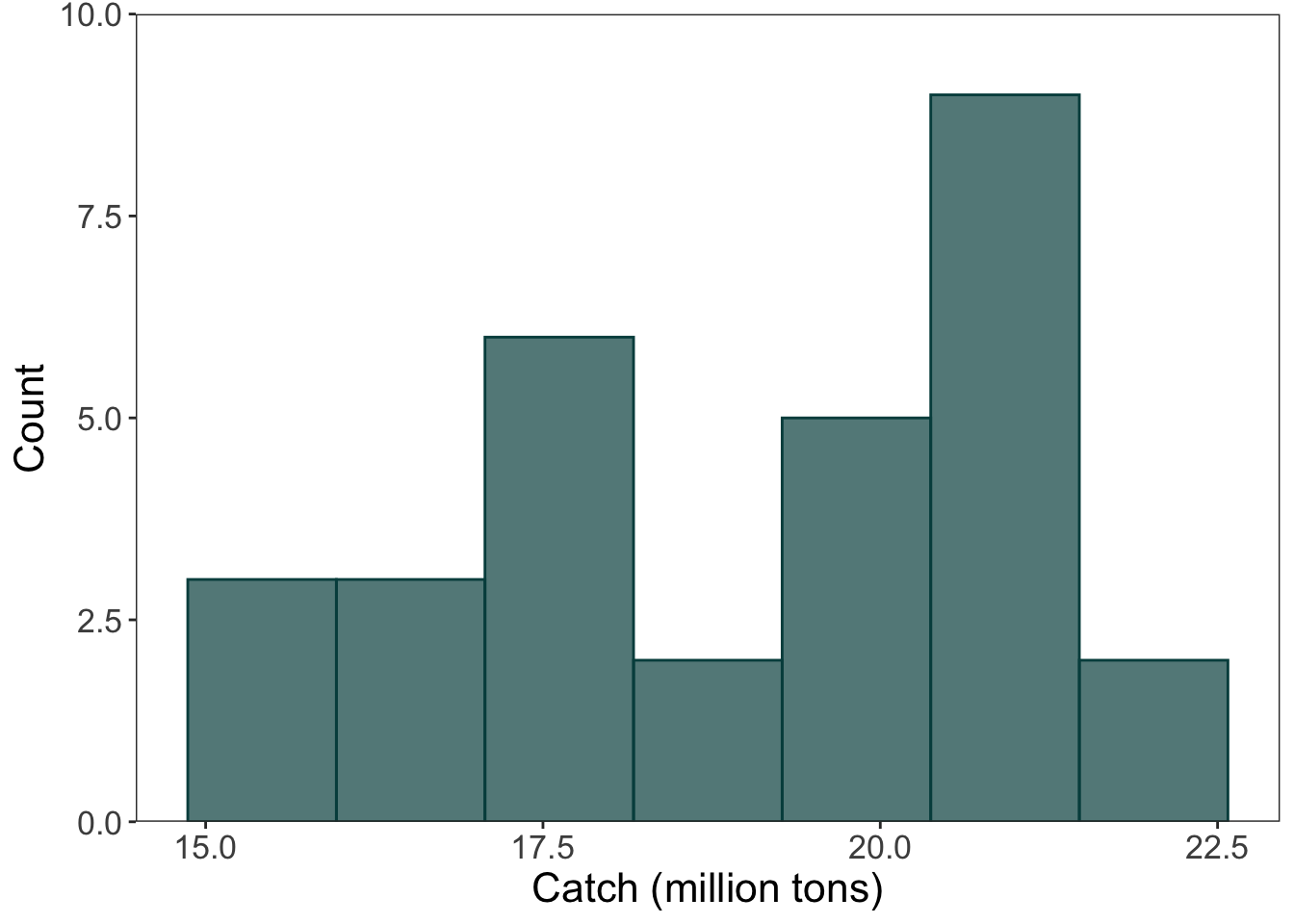
Exploring differences between groups using jitter plots
Function: geom_jitter()
How jitters work
geom_jitter() randomly shakes points left and right and up and down to make them easier to see. This is fine, but sometimes weird to have a jitter applied up and down when the y-axis actually represents a value that you’re interested in.
Below are two ways of creating a jitter plot: the simple way (with no customization for where the jittered points go), and the more custom way (where you can control the position of the jittered points relative to the x- and y-axes).
Simple jitter (no customization):
# simple way to create a jitter plot
ggplot(data = global_catch_clean, # data frame
       aes(x = fishery_full_name, # x-axis
           y = catch_mil)) + # y-axis
  geom_jitter()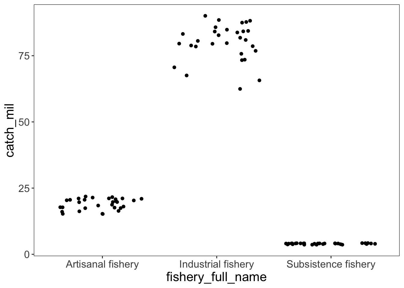
Custom jitter with position = position_jitter():
# a way with a little more control over the jitter
ggplot(data = global_catch_clean, # data frame
       aes(x = fishery_full_name, # x-axis
           y = catch_mil, # y-axis
           color = fishery_full_name)) + # coloring points by fishery - this is required for the scale_color_manual code to work!
  geom_jitter(position = position_jitter(
    width = 0.2, # shakes the points around left and right
    height = 0, # doesn't shake the points up and down
    seed = 1)) + # makes sure the "random" arrangement stays the same

  # extra stuff to make the plot look nicer
  # controlling the color of the points
  scale_color_manual(values = c("Artisanal fishery" = "#008080",
                                "Industrial fishery" = "#004c4c",
                                "Subsistence fishery" = "#b2d8d8")) +
  # labeling the y-axis
  labs(y = "Catch (million tons)") +
  theme(legend.position = "none", # taking out the legend
        axis.title.x = element_blank()) # taking out the x-axis title (redundant)
Exploring differences between groups using boxplots
Function: geom_boxplot()
A boxplot shows the median of a group, the interquartile range, and 1.5x the interquartile range.
ggplot(data = global_catch_clean, # data frame
       aes(x = fishery_full_name, # x-axis
           y = catch_mil, # y-axis
           fill = fishery_full_name)) + # filling the boxplot by fishery, again needed for the scale_fill_manual code to work!
  geom_boxplot() +

  # extra stuff to make the plot look nicer
  # controlling the fill of the boxplots
  scale_fill_manual(values = c("Artisanal fishery" = "#008080",
                                "Industrial fishery" = "#004c4c",
                                "Subsistence fishery" = "#b2d8d8")) +
  # labeling the y-axis
  labs(y = "Catch (million tons)") +
  theme(legend.position = "none", # taking out the legend
        axis.title.x = element_blank()) # taking out the x-axis title (redundant)
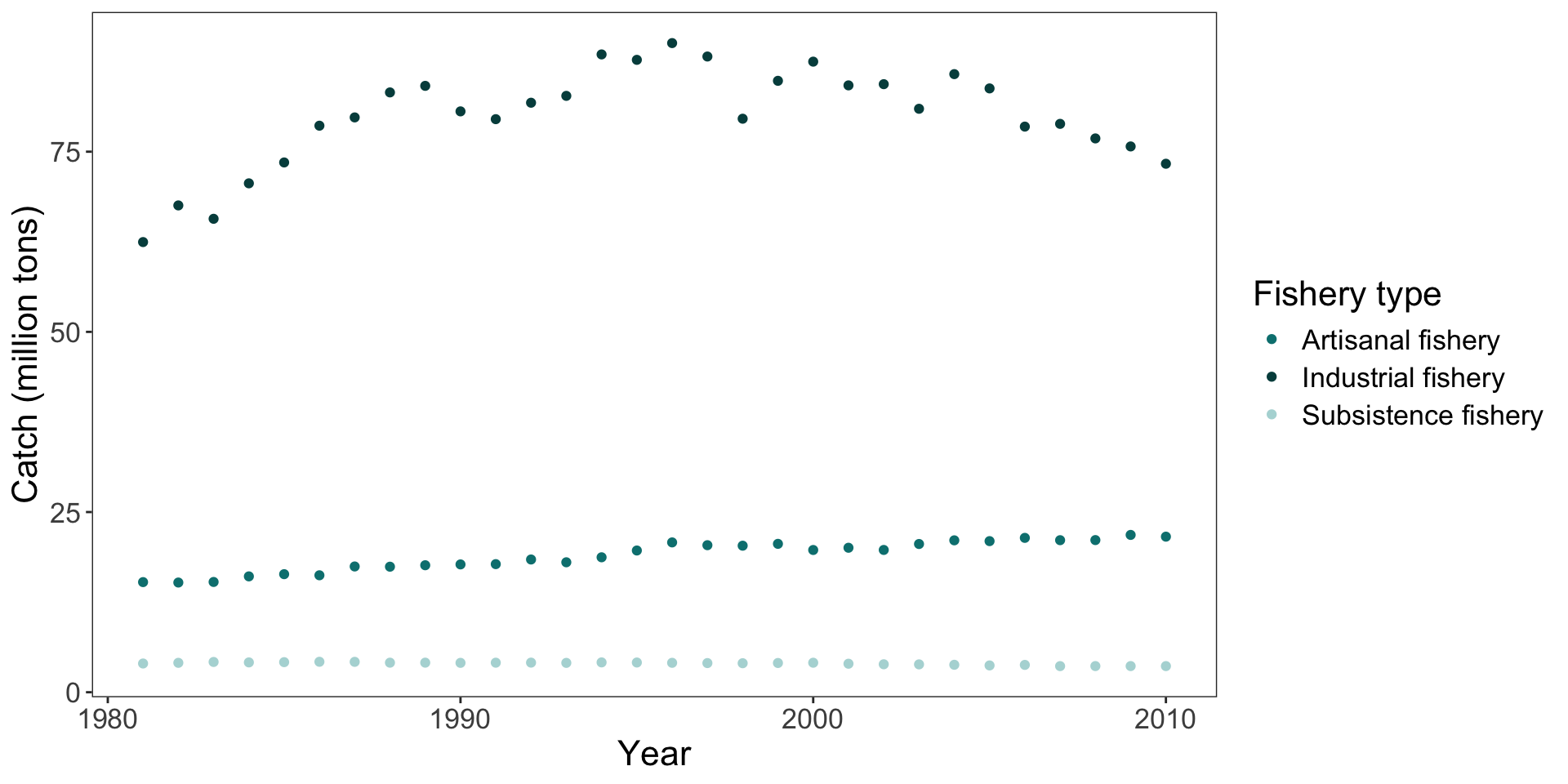
Exploring relationships between variables using scaterplots
Function: geom_point()
In this example, the x-axis is year and the y-axis is catch (million tons), but you can explore any continuous variables this way!
ggplot(data = global_catch_clean, # data frame
       aes(x = year, # x-axis
           y = catch_mil, # y-axis
           color = fishery_full_name)) + # coloring by fishery
  geom_point() +

  # extra stuff to make the plot look nicer
  # controlling the color of the points
  scale_color_manual(values = c("Artisanal fishery" = "#008080",
                                "Industrial fishery" = "#004c4c",
                                "Subsistence fishery" = "#b2d8d8")) +
  # labeling the y-axis and the legend
  labs(x = "Year",
       y = "Catch (million tons)",
       color = "Fishery type")